The huge difference between left and right, is photography composition important?
2018.08.16
"We hear of the golden ratio, the rule of thirds, but are these seemingly professional methods of composition actually essential to a photographer? Today we will leave these composition rules aside, and look at how characters and objects should be placed in order to achieve the look and feel you desire in your photos."
The general consensus is that composition is something that has to be done right all at once during the photoshoot, however, unless the photo shoot is done in a studio, it is rather difficult to get the composition all settled at once while shooting. There will often be all sorts of reasons that will result in the need to crop the image afterwards during editing to reframe the composition. But how should we approach composition exactly? Many tutorials will speak of the golden ratio, the rule of thirds and complicated things such as perspective composition.
But what exactly would be considered a good composition? I, personally, think that all these rules of composition as nothing more than smoke and mirrors. I think that above anything else, images that can “get its point across to the viewers” are to be considered the best kind of compositions.
There are no definitive formulas to photography composition, as there will be all sorts of suitable compositions depending on the different theme and settings of your shots. When I mentioned previously that all these rules are smoke and mirrors, it’s because the real reasons that decide whether a picture looks good or immersive or not should be explored through “cognitive psychology”. Human eyes are prone to trickery, if there is even one hint in an image that can trigger a person’s imagination, that picture can be said to be a “heartfelt” one.
 A lot of “professionals” would tell you not to put your subject right in the middle of the frame, because it doesn’t look good. But is that really the case?
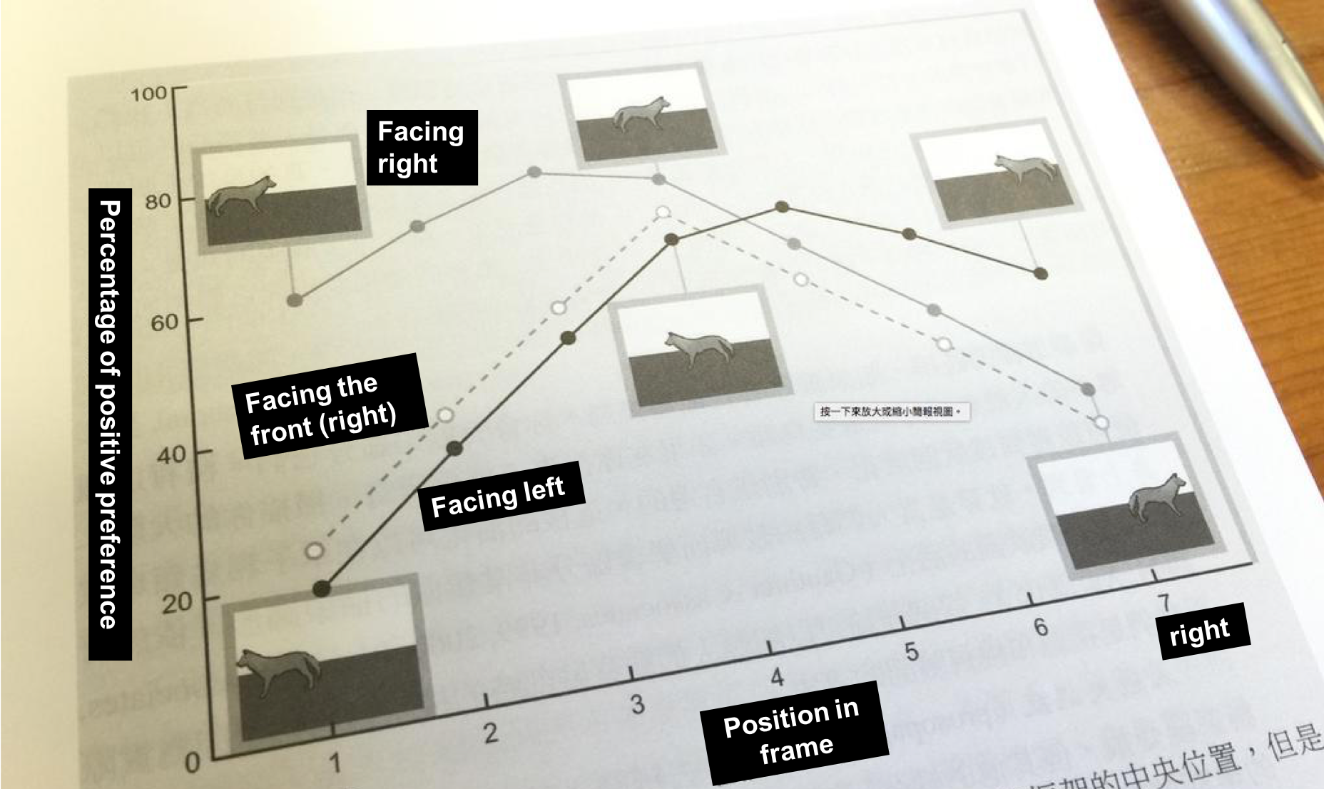
It is discovered through cognitive psychology experiments, that test subjects actually mostly prefer compositions where the main subject of the scene is placed right in the middle of a photo. And when the subject is facing the edge of the frame, as in when the dog is facing the left and framed on the left side of the photo (or vice versa), test subjects tend to like it less compared to compositions where the subject is framed in the middle of the shot.
You will find that, after observing the results of these experiments, the elements that actually affect people’s preference of a photo actually has little to do with the rule of thirds or the golden ratio and such. What really attracts people are the imagery formed by the poses and positions of the main subject in the frame. We’ll do a little experiment with the image below:
A lot of “professionals” would tell you not to put your subject right in the middle of the frame, because it doesn’t look good. But is that really the case?
It is discovered through cognitive psychology experiments, that test subjects actually mostly prefer compositions where the main subject of the scene is placed right in the middle of a photo. And when the subject is facing the edge of the frame, as in when the dog is facing the left and framed on the left side of the photo (or vice versa), test subjects tend to like it less compared to compositions where the subject is framed in the middle of the shot.
You will find that, after observing the results of these experiments, the elements that actually affect people’s preference of a photo actually has little to do with the rule of thirds or the golden ratio and such. What really attracts people are the imagery formed by the poses and positions of the main subject in the frame. We’ll do a little experiment with the image below:
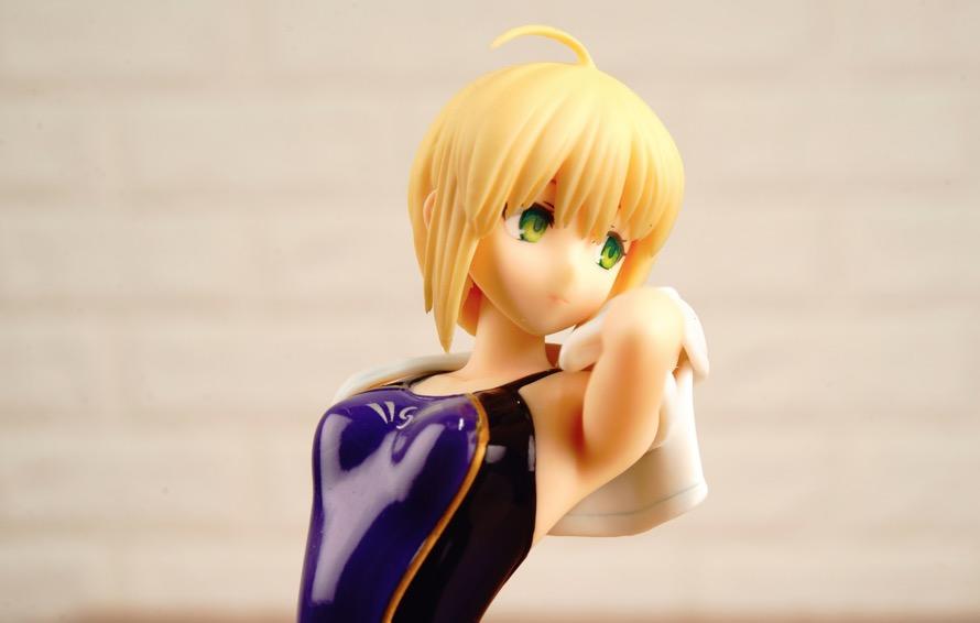 I have placed Saber right in the middle of this picture, and thanks to the high resolution of the D800E, I am able to crop the image and place her either on the right or the left of the frame without the image becoming too low quality to be used. This Saber figurine also happens to not be looking into the camera, so we can do an experiment here similar to that of the one with the dog.
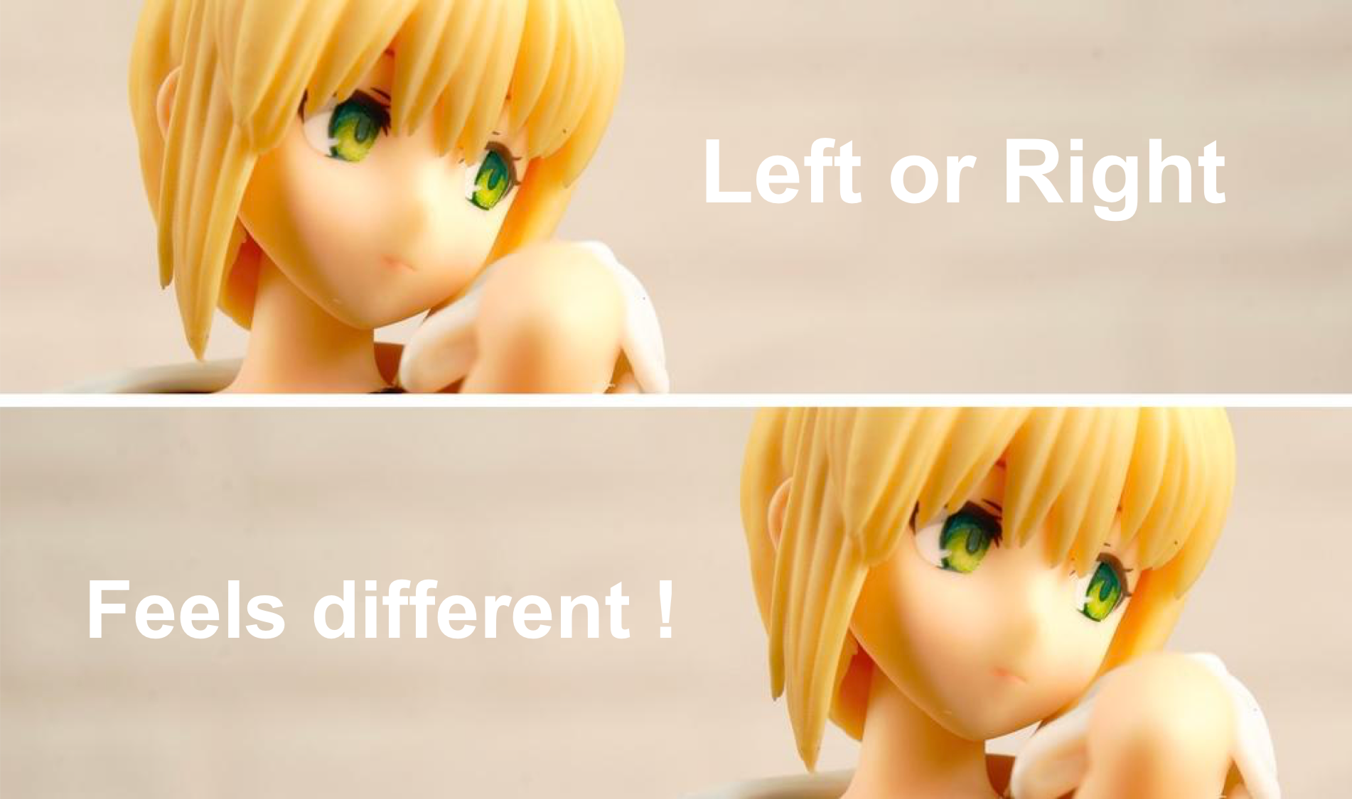
 I crop the image of Saber into the two versions displayed above, one where she’s one third to the left, and the other where she’s one third to the right. Don’t you think these two pictures give out very different vibes? Now let’s add some words to the pictures to further demonstrate the differences these two pictures' radiates.
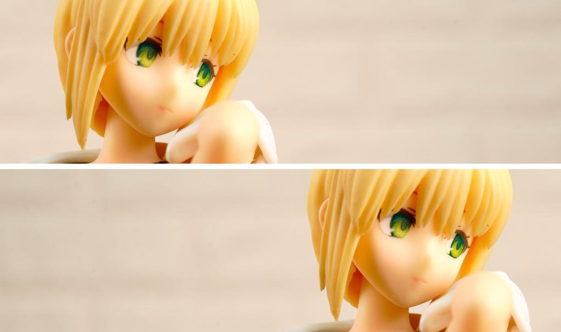
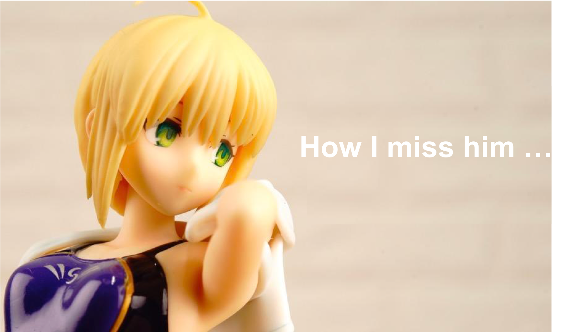 When Saber gazes at the middle of the image, the shot will emanate a sense of deep yearning and longing, with the words “how I miss him” is just appropriate.
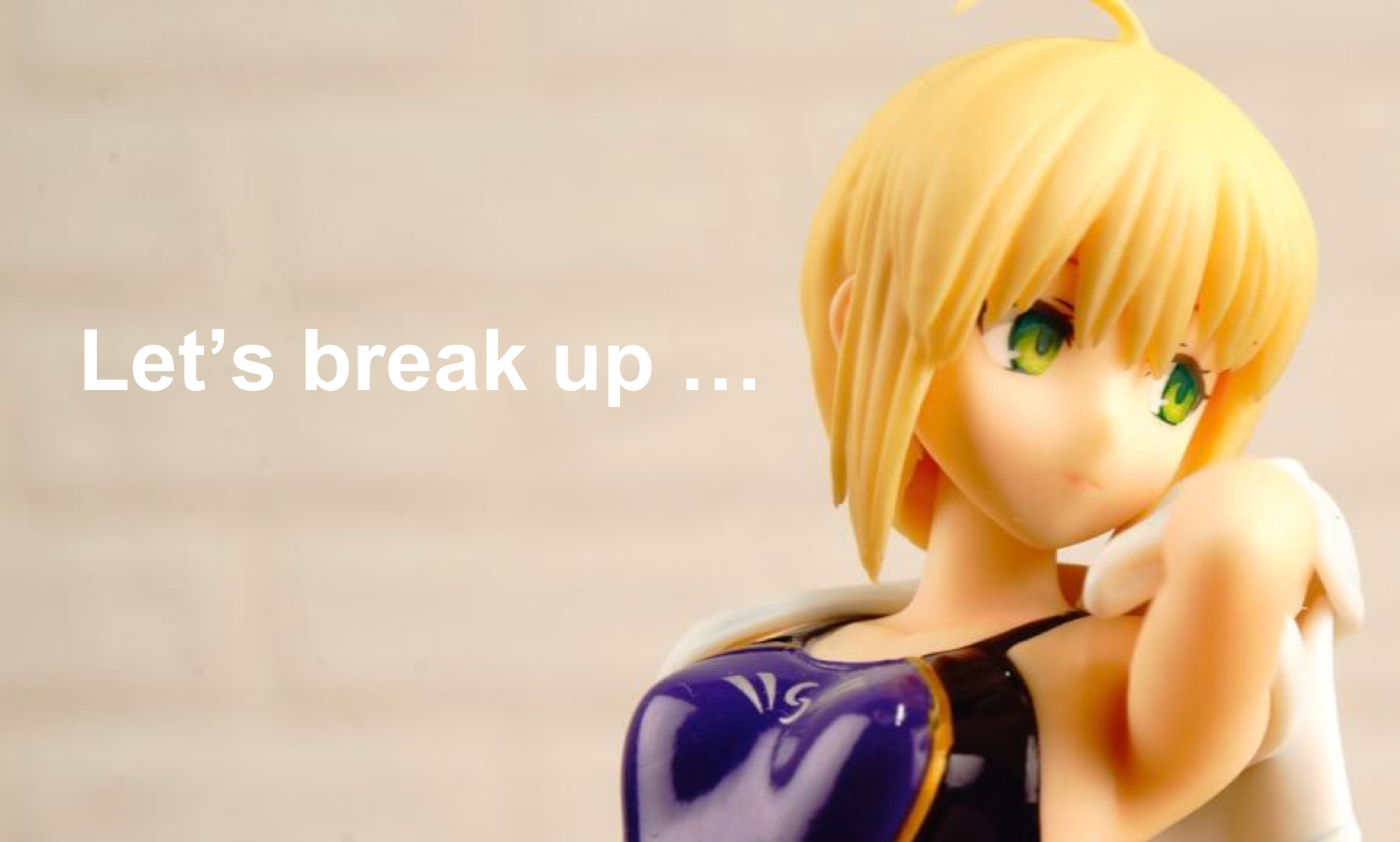 But what if it’s the other way around? All in a sudden, Saber’s gaze became a crestfallen, dispirited one, much befitting of the words “let’s break up”.
The two images are cropped from the same photo, but because of the different framing of the subject, the direction of the gaze gives the two pictures completely different feelings, appearing from longing to separation within the snap of a finger. So what do you say? Is cropping for composition important? Of course, it is! Because different compositions can completely alter the way an image will be perceived by its audiences.
But are the so-called composition rules important at all?
But what if it’s the other way around? All in a sudden, Saber’s gaze became a crestfallen, dispirited one, much befitting of the words “let’s break up”.
The two images are cropped from the same photo, but because of the different framing of the subject, the direction of the gaze gives the two pictures completely different feelings, appearing from longing to separation within the snap of a finger. So what do you say? Is cropping for composition important? Of course, it is! Because different compositions can completely alter the way an image will be perceived by its audiences.
But are the so-called composition rules important at all?
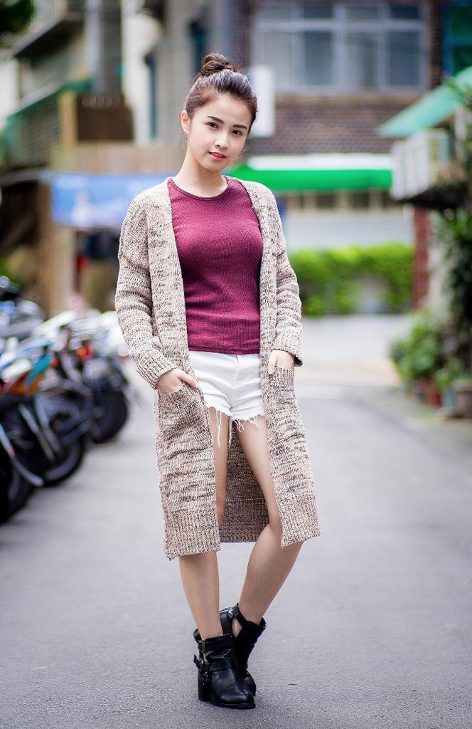 Look at this image above, where the person is placed right in the middle of the frame, do you find it to be unappealing, uncomfortable and unlikeable?
I would not assume so. No one is going to think twice about the rules when there’s a pretty girl to see. Who cares about composition? Human eyes are easily deceived, so instead of thinking about how to “composite” your images so it follows the rules, you should rather ask yourself this: does the way you crop your photo actually allow it to convey what you want?
If you are interested in our articles, you can also LIKE our page:)
Look at this image above, where the person is placed right in the middle of the frame, do you find it to be unappealing, uncomfortable and unlikeable?
I would not assume so. No one is going to think twice about the rules when there’s a pretty girl to see. Who cares about composition? Human eyes are easily deceived, so instead of thinking about how to “composite” your images so it follows the rules, you should rather ask yourself this: does the way you crop your photo actually allow it to convey what you want?
If you are interested in our articles, you can also LIKE our page:)
Want to see more related articles? CLICK ME to enter the Chinese version website.
相關文章
-
Dedicated to new photography fans, three key methods for the operation of Speedlights
-
Understanding these will allow you to easily play with filters
-
Methods on shooting interior lighting
-
The lighting for food is important? Let Tastemade tell you!
-
The 5 main thoughts on shooting proper wedding photos!
-
Here comes the masterlist for photography posing! Learn all at once how you can shoot modeling photos