Understanding these will allow you to easily play with filters
2018.07.30
“Professional post production can be as complicated as it gets, but just by acquiring the basic knowledge of the different attributes, you can also easily salvage mis-shot images, and even develop your own unique visual style. This article will explain the purpose and relationships of the four attributes ‘exposure, contrast, tint and temp’, and how to adjust them using Lightroom.”
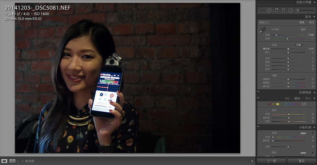 Image above: this is the interface of Adobe Lightroom, other companies like Nikon also have their own similar software. While they may differ in appearance, the concepts are more or less the same.
There are two concepts you must be familiar with before playing with digital darkrooms: first, is what RAW files are, and second, the meaning the “values” you see in the digital darkrooms hold. We will be discussing the values later today, as for RAW files, what exactly are they? First, remember one thing, that is when your camera saves an image as a “jpg” file, the color performance in the final image is predetermined by the original factory design setting of your camera. The colors are already modified the moment you press the shutter and the camera saves and compiles your photo into your memory card. That is why there is the saying that Canon is good for portrait photography(because the default settings make Asian people’s skin color appear lighter and smoother). On the other hand, RAW files are not compiled by the camera and record the complete information captured in an image. Due to it containing all the information that can be processed by the camera’s maximum capacity, there is a much larger flexibility for post-production, and the results will not be as heavily influenced by the factory settings of the camera. This allows photos produced with a Nikon to also achieve the skin color enhancement of Canon photos, making RAW files the favorite file type of professional photographers and designers.
Image above: this is the interface of Adobe Lightroom, other companies like Nikon also have their own similar software. While they may differ in appearance, the concepts are more or less the same.
There are two concepts you must be familiar with before playing with digital darkrooms: first, is what RAW files are, and second, the meaning the “values” you see in the digital darkrooms hold. We will be discussing the values later today, as for RAW files, what exactly are they? First, remember one thing, that is when your camera saves an image as a “jpg” file, the color performance in the final image is predetermined by the original factory design setting of your camera. The colors are already modified the moment you press the shutter and the camera saves and compiles your photo into your memory card. That is why there is the saying that Canon is good for portrait photography(because the default settings make Asian people’s skin color appear lighter and smoother). On the other hand, RAW files are not compiled by the camera and record the complete information captured in an image. Due to it containing all the information that can be processed by the camera’s maximum capacity, there is a much larger flexibility for post-production, and the results will not be as heavily influenced by the factory settings of the camera. This allows photos produced with a Nikon to also achieve the skin color enhancement of Canon photos, making RAW files the favorite file type of professional photographers and designers.
 RAW files contain the most information, therefore has more values available for adjustment in programs such as Lightroom. Today, two types of values will be introduced, these being the white balance and brightness contrast. These two values have the largest potential to save photos that are shot with the wrong exposure or white balance setting and can be thought of as the first and most important values to understand when learning digital darkrooms. The program I am using is Adobe Lightroom, if you’re used to something else, or have another such program that is free(Lightroom costs money! Though if you purchase a Leica camera they will give it to you for free), you can also reference this article to learn about the meanings of each of these values, as they are universally applicable. Though the names may be slightly different in each program, the basic principles remain the same.
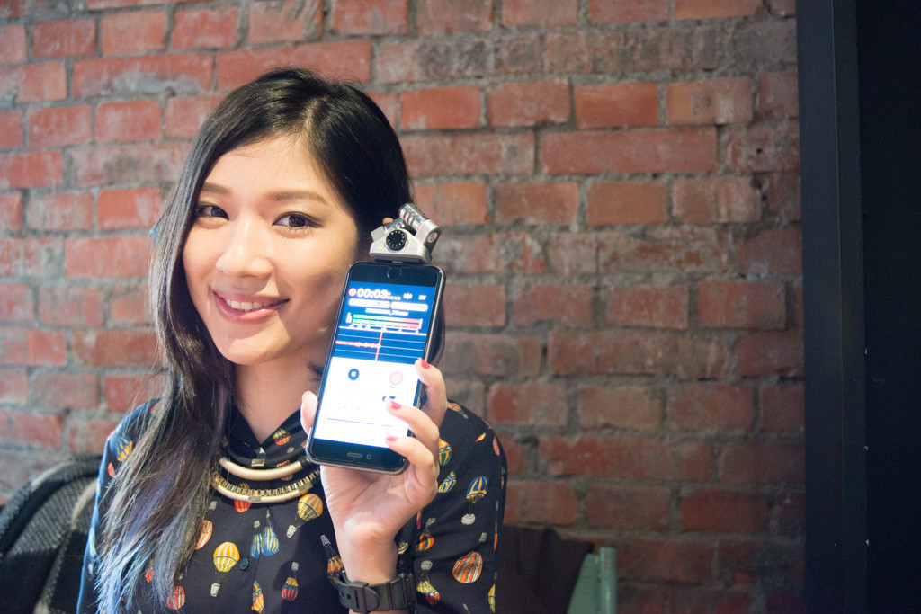
Exposure value: Miscalculated the exposure? Adjust the exposure value and easily save photos that came out too dark or too bright
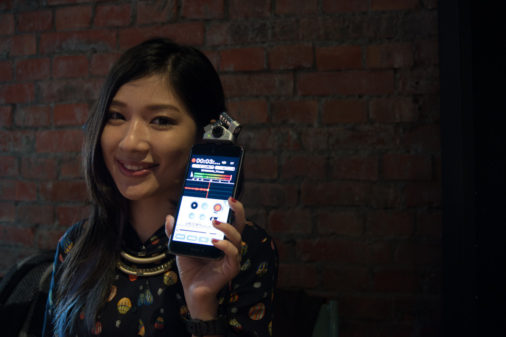 If you’re determined to stick with an Automatic mode or even Manual mode, then you must have taken photos like the one above that came out dark and gloomy due to the wrong exposure setting. If you were shooting in a compressed format like jpg, to begin with, then you best just… give up them. Even if you try to salvage it with Lightroom, you won’t be able to avoid problems such as noise and irregular color levels in your result. But if you were shooting in RAW format, then your photo is fixable!
 When editing photos, I always adjust the “exposure” first, changing the brightness of the photo to an acceptable and normal level by using +1... or -1… For instance, the image above was the result of adjusting the exposure to +2, successfully turning the photo that came out accidentally too dark to a brightness that is clearly visible to the eye. If your resulted photo is too bright by accident, then adjust it back by using -1… As for how much you should adjust the values by, to determine it for yourself by assessing the brightness of your photo. The results of these adjustments are all immediately reflected as you tweak the values, so please judge for yourself the suitable exposure of your image.
Contrast: Photo looking grayish after adjusting the brightness? Solve it by modifying the contrast!
 In most programs, the setting for contrast and brightness(exposure) is placed together. After changing the exposure of the above image, you may find that although the image as a whole became brighter, it also appears “grayish” and gloomy. That is because when an image is brightened by adjusting the exposure, its contrast level will decrease, resulting in similar colors appearing more “similar” to each other, making the image appear as if it is covered by a thin level of mist. When this happens, you can enhance the color differences by adjusting the level of contrast of the image, allowing the different colors to stand out, effectively solving the problem of an image that appears too gloomy after adjusting the brightness. In the image above, the contrast level is adjusted to +100(the maximum setting available in Lightroom), as you can see, the division between the highlights and shadows became very distinct, making the contrast of the whole image extremely high. Though for most portraits, a +20 setting would suffice, the image above is only adjusted to +100 for the purpose of demonstrating the effect.
Solving the details of the brightness problem: Adjustment of highlights and shadows
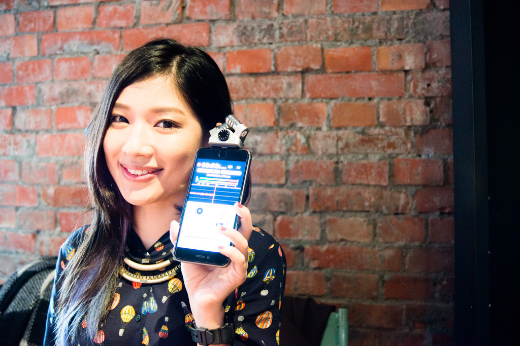
 Although Lightroom has a powerful photo editing function, it is still impossible for you to get your desired effect just by changing the exposure and contrast. For example, in the picture above we wish for the person’s face to not be too dark, but at the same time, have to also make sure the phone screen isn’t too bright(in that picture, if the face is bright enough, the screen becomes too bright since the screen itself is much brighter than the face). We will not be able to do this by only using the exposure and contrast function introduced above. While naturally you could use brushes or advanced tools to do selective area adjustment, but what if you need edit a large area, or many different selective areas(such as multiple faces and phone screens)? This is where the highlights and shadows setting come into play.
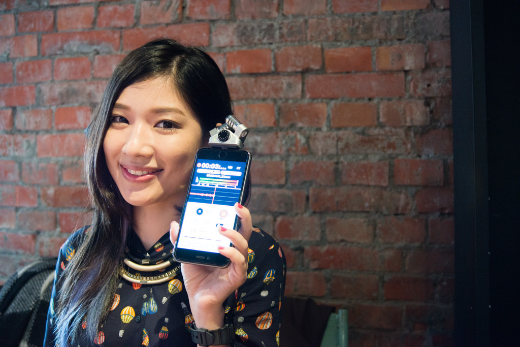
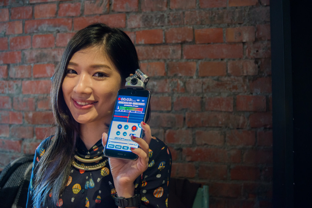 Image above: HIghlights -100
“Highlights” are regions on an image that is brighter than the other areas, and “shadows” on the other hand are regions that are notably darker. In the screenshot of the Lightroom interface earlier you can see that the four options Highlights, Shadows, Whites and Blacks are placed after Exposure and Contrast, there to allow you to adjust the details of your photo. Say for the image above, previously we needed to lower the brightness of the phone screen so it remains at roughly the same brightness as the person’s face, this is when we can drag the slider for the highlights to the left, effectively lowering the brightness of the comparatively brighter parts of the image(ex. The phone screen being the brightest bit in said image). After the adjustment, as can be seen in the result above, the brightness of the phone screen has been lowered to approximately the same level as the face, after that, the “exposure” setting could be used again to bring the photo to a regular brightness again while keeping the phone screen clear.
Image above: HIghlights -100
“Highlights” are regions on an image that is brighter than the other areas, and “shadows” on the other hand are regions that are notably darker. In the screenshot of the Lightroom interface earlier you can see that the four options Highlights, Shadows, Whites and Blacks are placed after Exposure and Contrast, there to allow you to adjust the details of your photo. Say for the image above, previously we needed to lower the brightness of the phone screen so it remains at roughly the same brightness as the person’s face, this is when we can drag the slider for the highlights to the left, effectively lowering the brightness of the comparatively brighter parts of the image(ex. The phone screen being the brightest bit in said image). After the adjustment, as can be seen in the result above, the brightness of the phone screen has been lowered to approximately the same level as the face, after that, the “exposure” setting could be used again to bring the photo to a regular brightness again while keeping the phone screen clear.
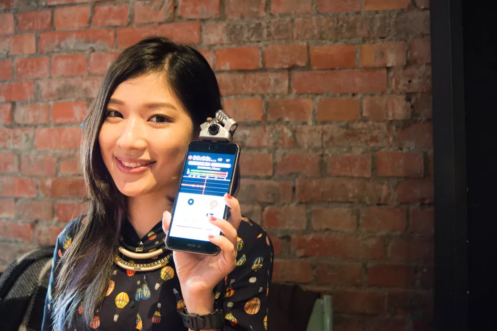
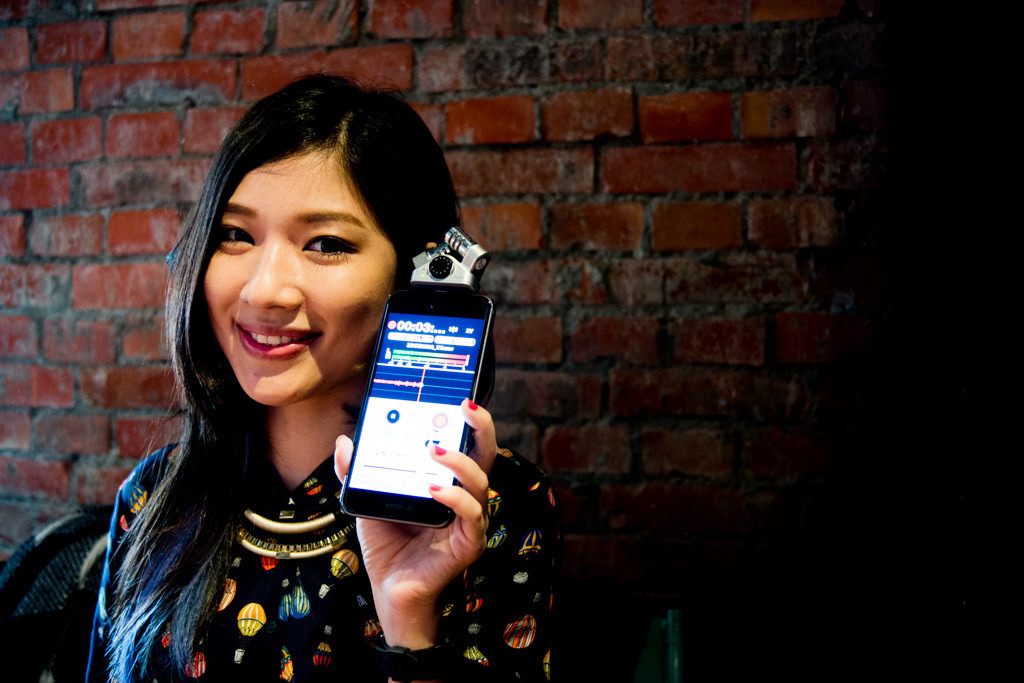 Image above: Shadows -100
Highlights are used to modify the brighter bits of a photo, and naturally, shadows are used to modify the darker bits. The above image has its shadows setting set to -100, therefore making the darker portions of the original photo even more shadowy and black. You could do this if you want a strong contrast effect on your photo. Furthermore, shadows adjustment can also be used to salvage portraits with dark faces due to an overly intense backlight, the same for backlit architecture photos where the buildings are too dark etc. You only need to drag the shadows adjustment setting to the right to raise the average brightness of the darker parts of your photo. In the above picture, this results in the wall corner on the right and the shades on the face becoming brighter. Editing the highlights and shadows is crucial in rescuing failed photos, because not only can these settings be used to fix the aforementioned dark faces and overexposed phone screens, it can also be used to fix overly bright skies in scenery shots or faces and backgrounds that become too dark after adjusting the overall brightness of the photo. As for the two other settings not mentioned, whites and blacks, their function is actually similar to highlights and shadows, though works a little bit differently in practice. Everyone can go and try out their own combination of settings! (Whites adjust the highlights, blacks adjust shadows)
—
Image above: Shadows -100
Highlights are used to modify the brighter bits of a photo, and naturally, shadows are used to modify the darker bits. The above image has its shadows setting set to -100, therefore making the darker portions of the original photo even more shadowy and black. You could do this if you want a strong contrast effect on your photo. Furthermore, shadows adjustment can also be used to salvage portraits with dark faces due to an overly intense backlight, the same for backlit architecture photos where the buildings are too dark etc. You only need to drag the shadows adjustment setting to the right to raise the average brightness of the darker parts of your photo. In the above picture, this results in the wall corner on the right and the shades on the face becoming brighter. Editing the highlights and shadows is crucial in rescuing failed photos, because not only can these settings be used to fix the aforementioned dark faces and overexposed phone screens, it can also be used to fix overly bright skies in scenery shots or faces and backgrounds that become too dark after adjusting the overall brightness of the photo. As for the two other settings not mentioned, whites and blacks, their function is actually similar to highlights and shadows, though works a little bit differently in practice. Everyone can go and try out their own combination of settings! (Whites adjust the highlights, blacks adjust shadows)
—
Temp(Colour temperature): Play around with warm colors and cool colors, freely adjust yellow and blue lights!
 What exactly is the color temperature? Colour temperature is actually a value related to “white balance”, which is an important value that decides “which color” the white parts of your photo will display. Why do we need to adjust the white balance? For instance, if you shoot under a yellow light, the whites will appear yellow in your final image due to that light source, and the question is, do you like it when your face appear yellowish due to you shooting under a yellow light?
 Image above: Temp 3850
Most cafes, or “bookish” stores like using these yellowish light as seen in the picture above, although it makes the pictures taken there look more atmospheric in general, it puts a strain on the eyes after staring too long. The “temp” setting in Lightroom is an important setting to let you adjust the white balance of a photo, it can very naturally and evenly modify the white balance of the whole photo, something that won’t be so simple after exporting it from Lightroom to Photoshop, so it is essential to get it done here before you export your image. How do you adjust the color temperature then? This is very simple, all you need to do is remember “high temp makes it yellow, low temp makes it blue” and you’re done! Returning to the example above, due to the yellow light in the cafe, the photo came out too yellow, which means that its “color temperature is too high”.
Image above: Temp 3850
Most cafes, or “bookish” stores like using these yellowish light as seen in the picture above, although it makes the pictures taken there look more atmospheric in general, it puts a strain on the eyes after staring too long. The “temp” setting in Lightroom is an important setting to let you adjust the white balance of a photo, it can very naturally and evenly modify the white balance of the whole photo, something that won’t be so simple after exporting it from Lightroom to Photoshop, so it is essential to get it done here before you export your image. How do you adjust the color temperature then? This is very simple, all you need to do is remember “high temp makes it yellow, low temp makes it blue” and you’re done! Returning to the example above, due to the yellow light in the cafe, the photo came out too yellow, which means that its “color temperature is too high”.
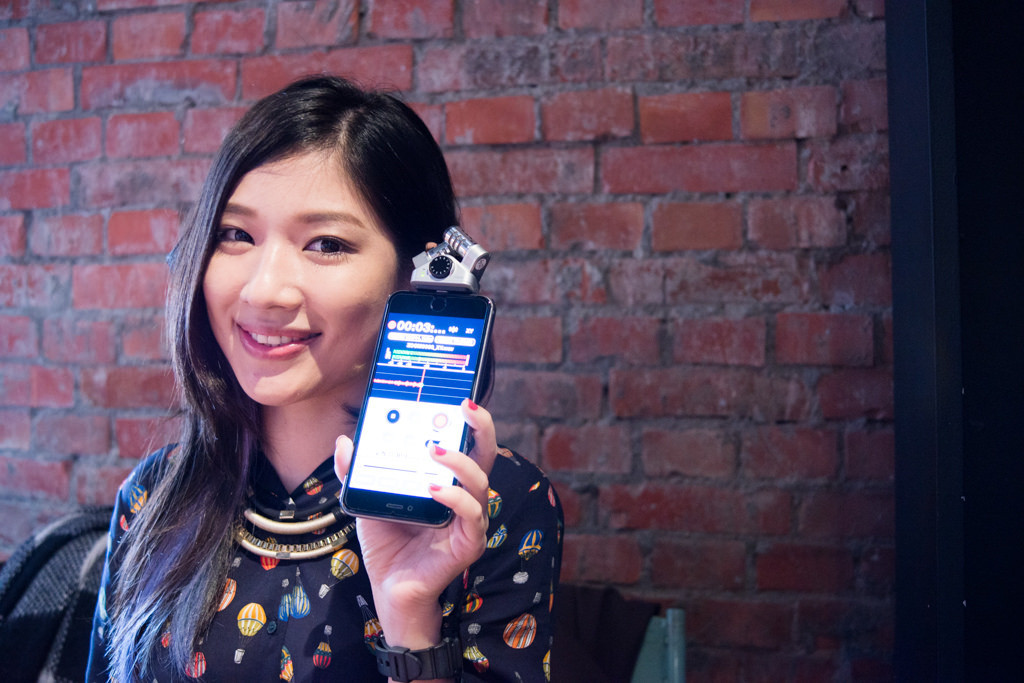
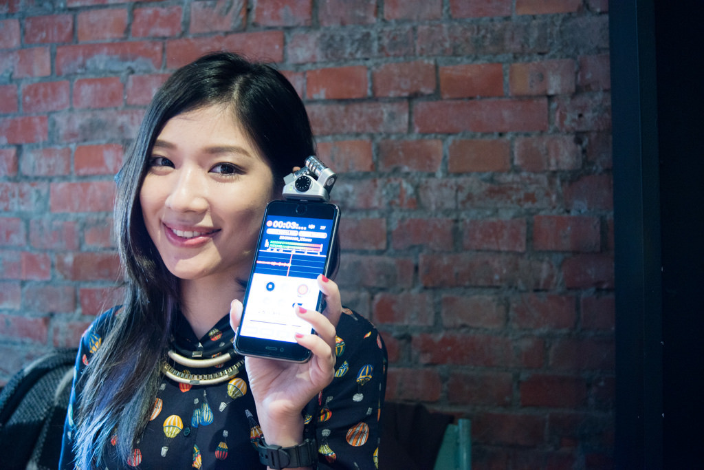 Image above: Temp 2800
This is where we can lower the color temperature, making the photo “less yellow” in order to prevent the face from appearing too yellowish. Though adjusting the temp is an important part of aesthetic: do we or do we not keep the on-location lighting? Or should we adjust every image so the faces appear normally-lit under white light? For example, if you are in a pub, or shooting at a wedding, do you adjust the white balance so every picture appears as if taken under the sun? Or do you not adjust the white balance, and retain the on-location lighting and colors of every photo? There are no correct answers to this, so do what you will depend on your intentions and judgment on photography aesthetics.
Note: Aside from normalising the colours of a photo, the colour temperature setting can also be used to make a photo more yellow to strengthen the atmosphere. When you don’t have a yellow light source to shoot a “warm”, “bookish” scene, you can use the colour temperature setting to make your image “warmer”; or if you want to capture the colour of a sunset on a cloudy day, you could also achieve that by adjusting the colour temperature. So try it for yourself and be creative.
Tint: Modify the reds and greens, the first step in editing skin color
There is another setting under temp called “tint”, and this value is also an important one that decides the overall tone and color of your image. While temp decides whether your photo is more yellow or blue(white as the median value), tint decides whether your photo will appear more red or more green. Generally speaking, after adjusting a photo to a more normal white color, it will also make the photo appear reddish or greenish(it’s like when you change the brightness the photo will get misty, these changes are interlinked), and this is where the tint setting comes in to solve the problem. The image above is the result after adjusting the color temperature, as you can see, the result looks rather “greenish”, if you turn a sweet lady into the hulk, I don’t suppose you should be asking her for photos anymore. So this is what we should do:
Image above: Temp 2800
This is where we can lower the color temperature, making the photo “less yellow” in order to prevent the face from appearing too yellowish. Though adjusting the temp is an important part of aesthetic: do we or do we not keep the on-location lighting? Or should we adjust every image so the faces appear normally-lit under white light? For example, if you are in a pub, or shooting at a wedding, do you adjust the white balance so every picture appears as if taken under the sun? Or do you not adjust the white balance, and retain the on-location lighting and colors of every photo? There are no correct answers to this, so do what you will depend on your intentions and judgment on photography aesthetics.
Note: Aside from normalising the colours of a photo, the colour temperature setting can also be used to make a photo more yellow to strengthen the atmosphere. When you don’t have a yellow light source to shoot a “warm”, “bookish” scene, you can use the colour temperature setting to make your image “warmer”; or if you want to capture the colour of a sunset on a cloudy day, you could also achieve that by adjusting the colour temperature. So try it for yourself and be creative.
Tint: Modify the reds and greens, the first step in editing skin color
There is another setting under temp called “tint”, and this value is also an important one that decides the overall tone and color of your image. While temp decides whether your photo is more yellow or blue(white as the median value), tint decides whether your photo will appear more red or more green. Generally speaking, after adjusting a photo to a more normal white color, it will also make the photo appear reddish or greenish(it’s like when you change the brightness the photo will get misty, these changes are interlinked), and this is where the tint setting comes in to solve the problem. The image above is the result after adjusting the color temperature, as you can see, the result looks rather “greenish”, if you turn a sweet lady into the hulk, I don’t suppose you should be asking her for photos anymore. So this is what we should do:
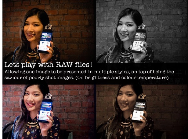
 Directly drag the tint setting to the right(red) will allow you to get rid of the weird greenish tint on the skin and have it appear in a soft pinkish tone instead. Through the adjustment of color temperature and tint, a photo’s color can be easily changed. Whether you want to edit a photo’s color to make it look like it is taken under a normal white light source, or intentionally adjust the color to create a Lomo style bookish look, you can utilize these two values to achieve all kinds of effects. The four image collage at the beginning of this article is created by tweaking these values in combination with different color temperature and tint settings.
That is the magic of editing RAW files, it gives you the most potential in modifying a photo’s brightness, contrast, color and sharpness when you can’t detect the damage in a photo. Today’s tutorial teaches everyone how to quickly fix a photo with incorrect lighting, and utilize temp and tint to stylise a photo, however, these settings alone are not enough for more detailed editing. In next week’s tutorial of digital darkrooms, we will look further into the different values that control an image’s color, allowing you to easily acquire the skill of “skin color adjustment”. Whether it is a soft and delicate skin you want to edit or green leaves that you want to turn red, they can all be achieved!
If you are interested in our articles, you can also LIKE our page:)
Directly drag the tint setting to the right(red) will allow you to get rid of the weird greenish tint on the skin and have it appear in a soft pinkish tone instead. Through the adjustment of color temperature and tint, a photo’s color can be easily changed. Whether you want to edit a photo’s color to make it look like it is taken under a normal white light source, or intentionally adjust the color to create a Lomo style bookish look, you can utilize these two values to achieve all kinds of effects. The four image collage at the beginning of this article is created by tweaking these values in combination with different color temperature and tint settings.
That is the magic of editing RAW files, it gives you the most potential in modifying a photo’s brightness, contrast, color and sharpness when you can’t detect the damage in a photo. Today’s tutorial teaches everyone how to quickly fix a photo with incorrect lighting, and utilize temp and tint to stylise a photo, however, these settings alone are not enough for more detailed editing. In next week’s tutorial of digital darkrooms, we will look further into the different values that control an image’s color, allowing you to easily acquire the skill of “skin color adjustment”. Whether it is a soft and delicate skin you want to edit or green leaves that you want to turn red, they can all be achieved!
If you are interested in our articles, you can also LIKE our page:)
相關文章
-
Photography is actually very simple: teaching you to understand what is EV exposure?
-
A good shot for commercial shooting: Start from light distribution!
-
Dedicated to new photography fans, three key methods for the operation of Speedlights
-
Methods on shooting in the interior of a car
-
Methods on shooting interior lighting
-
The lighting for food is important? Let Tastemade tell you!